Here are a bunch of Photoshops I've done over the passed week or so. They usually come in chunks just like the inspiration that creates them. I've been toying with a universal font "daft font" as an unofficial font for cXnX.

This one was 80's style all the way, or as it reminds me of ... my 2nd grade yearbook - no lie.

This is the first t-shirt candidate. Obviously a Ramones knock-off but with the cXnX flair of lobsters. I'm not totally convinced on the banner in the lobster's claws (which reads Woods cxnx Madness) but overall I am very happy with the design because I did it from scratch when I usually would take the original and copy over it.

This one was a metallic over red satin. Classy as shit.

This one is supposed to look like sharpie drawn on foil. Inspired from left overs from a restaurant.

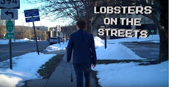
This was another inspiration from a day I was leaving a parking lot. S10 stands for September 2010 -when we were founded.

No clue. Suck it Heathcliff.

This was directly inspired from a Japanese Daft Punk album cover. Either a batsignal or jailbreak type of picture.

I had to do a bloody one, its in my nature.


No clue again. Suck it Albert.

This is an old ad for Dr. Raoulle's Medicated Tooth Power. It was briefly featured in Lobster Lobby.


0 Construxive Remarx